Poster design for the
Ensemble Theatre Company
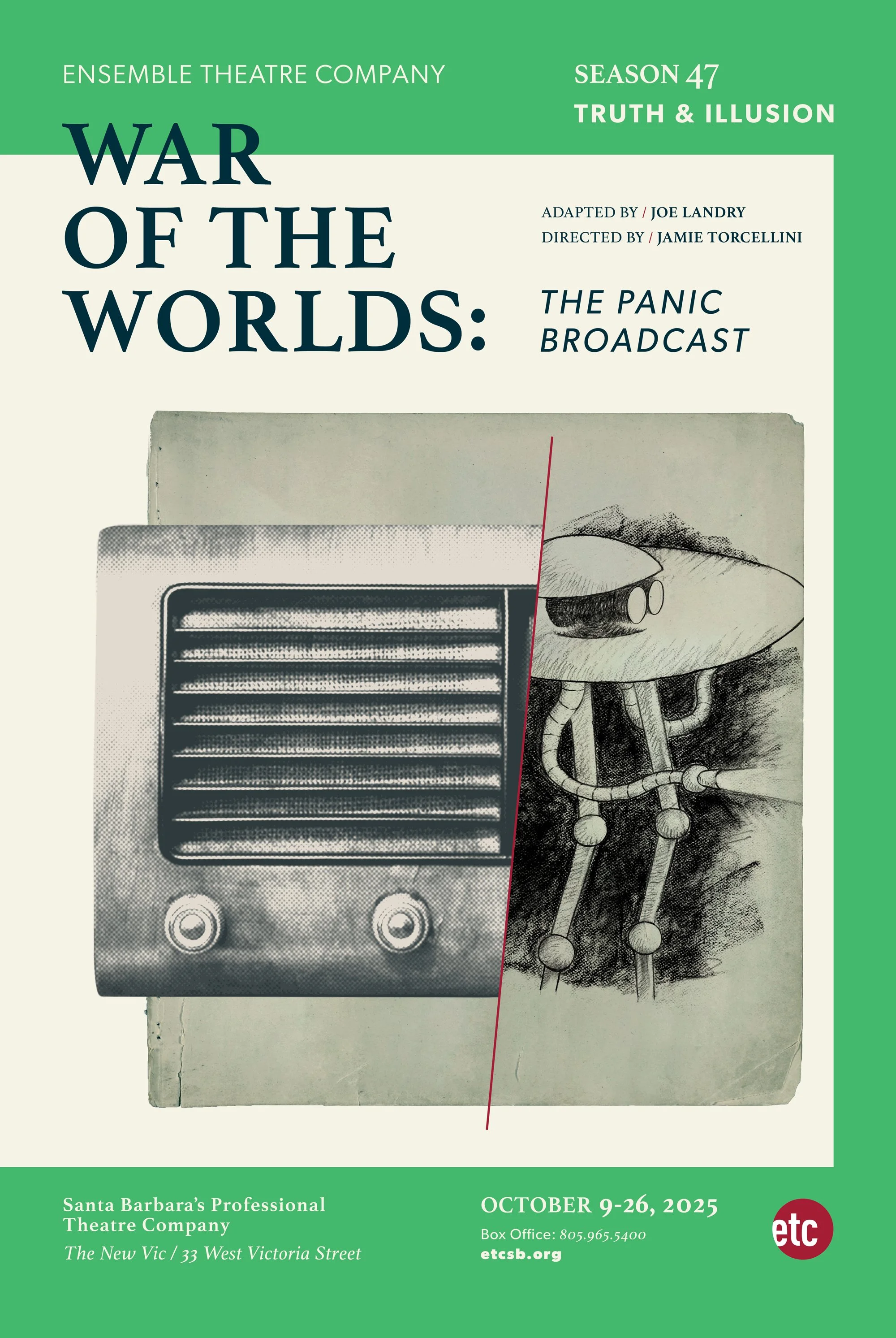
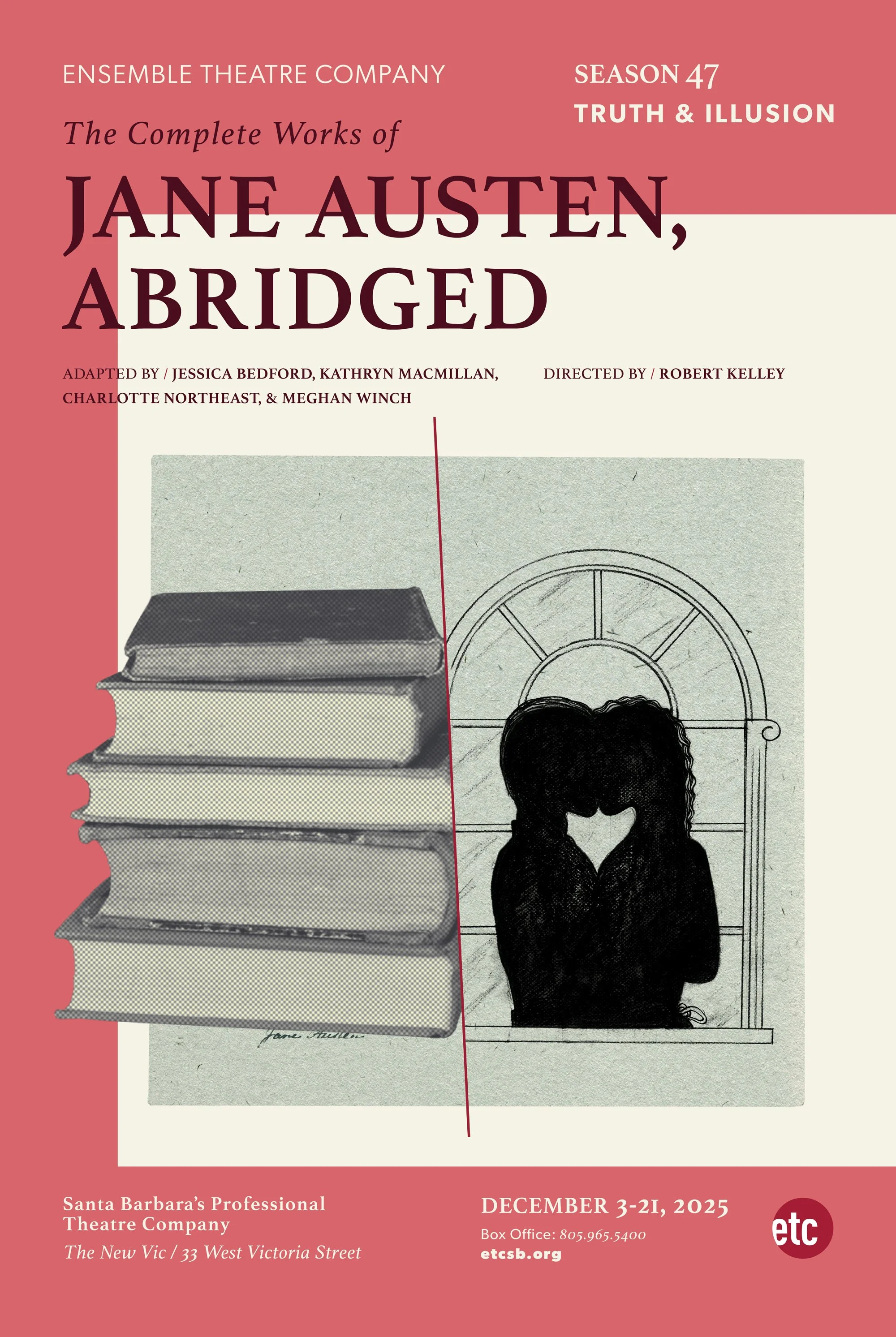
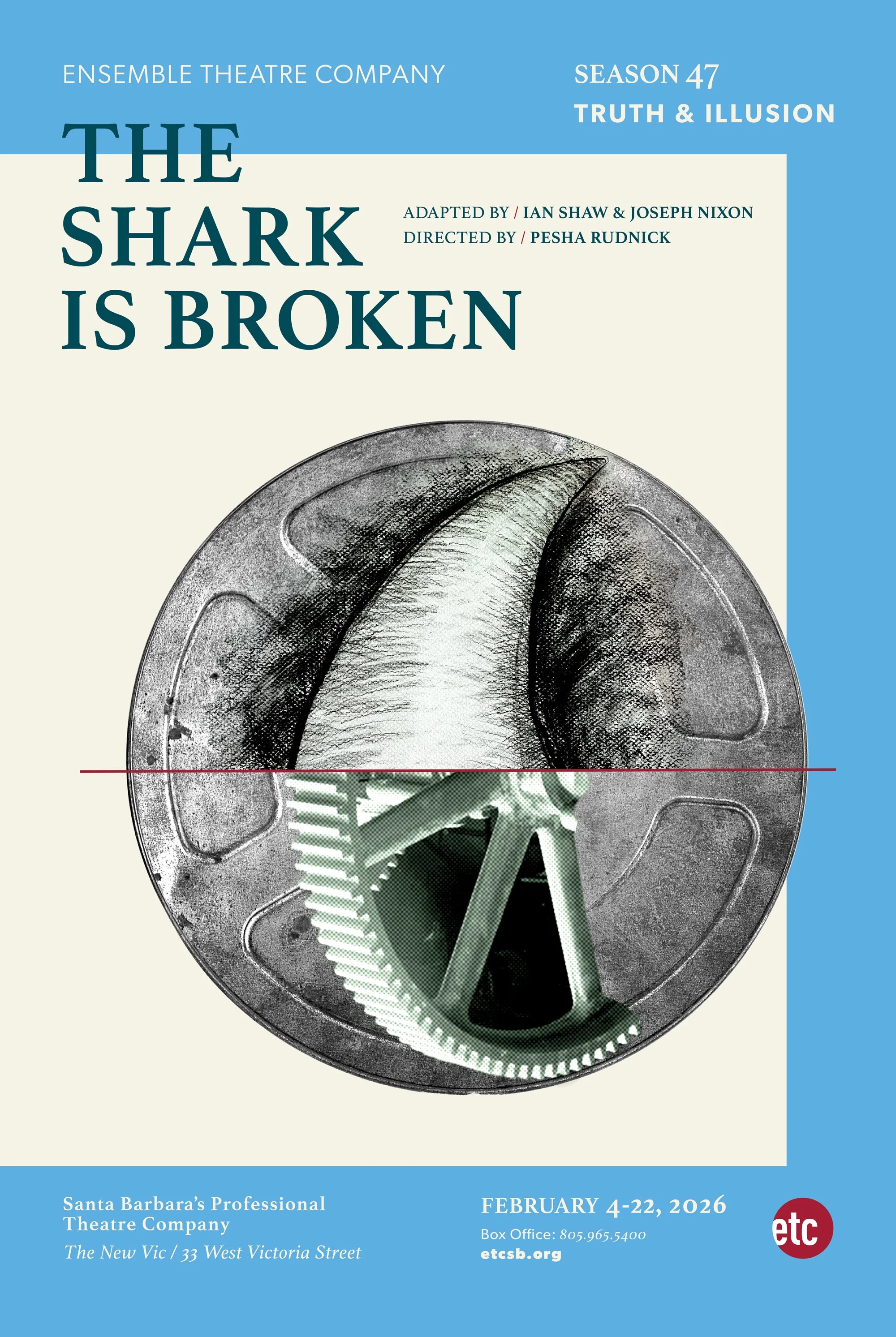
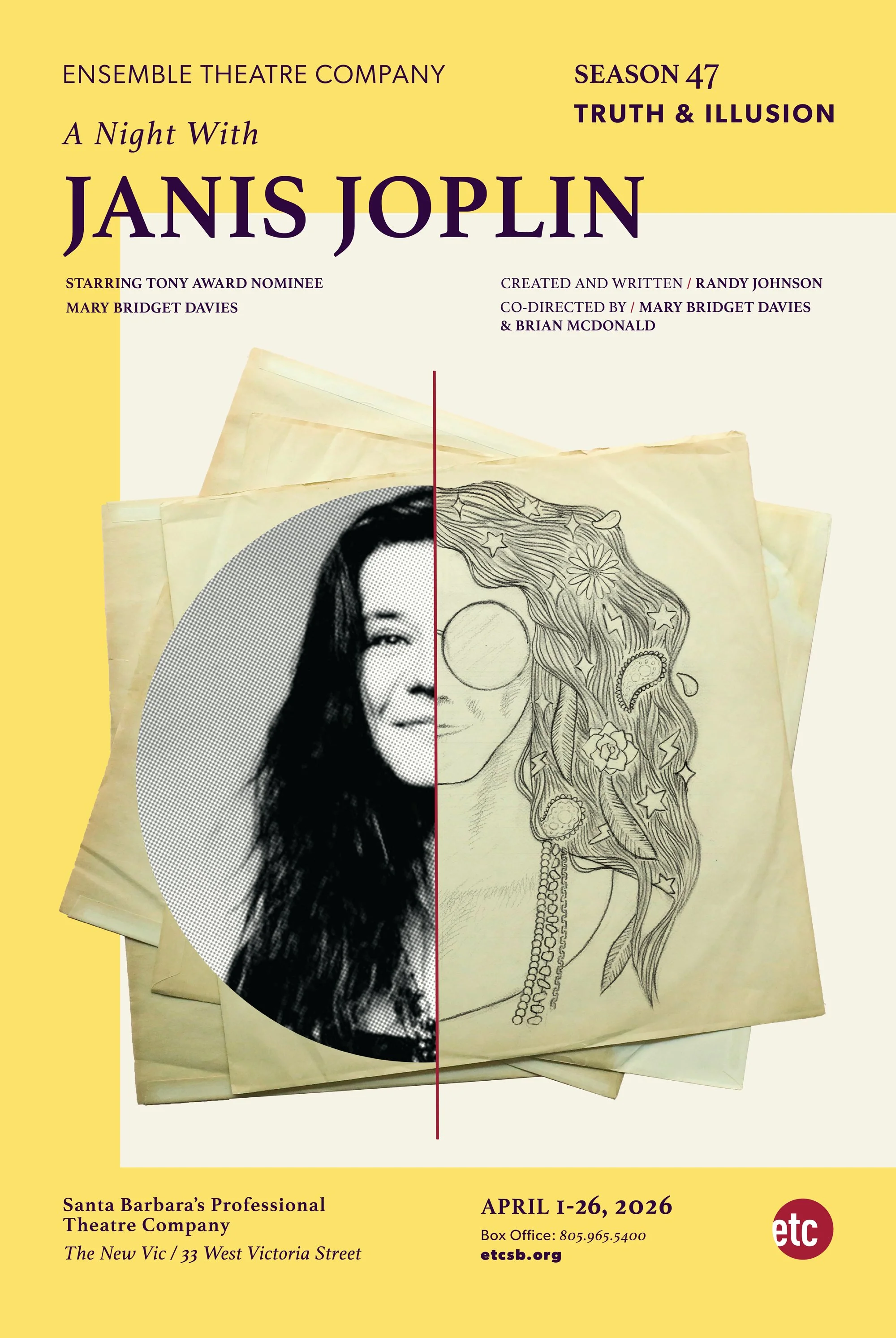
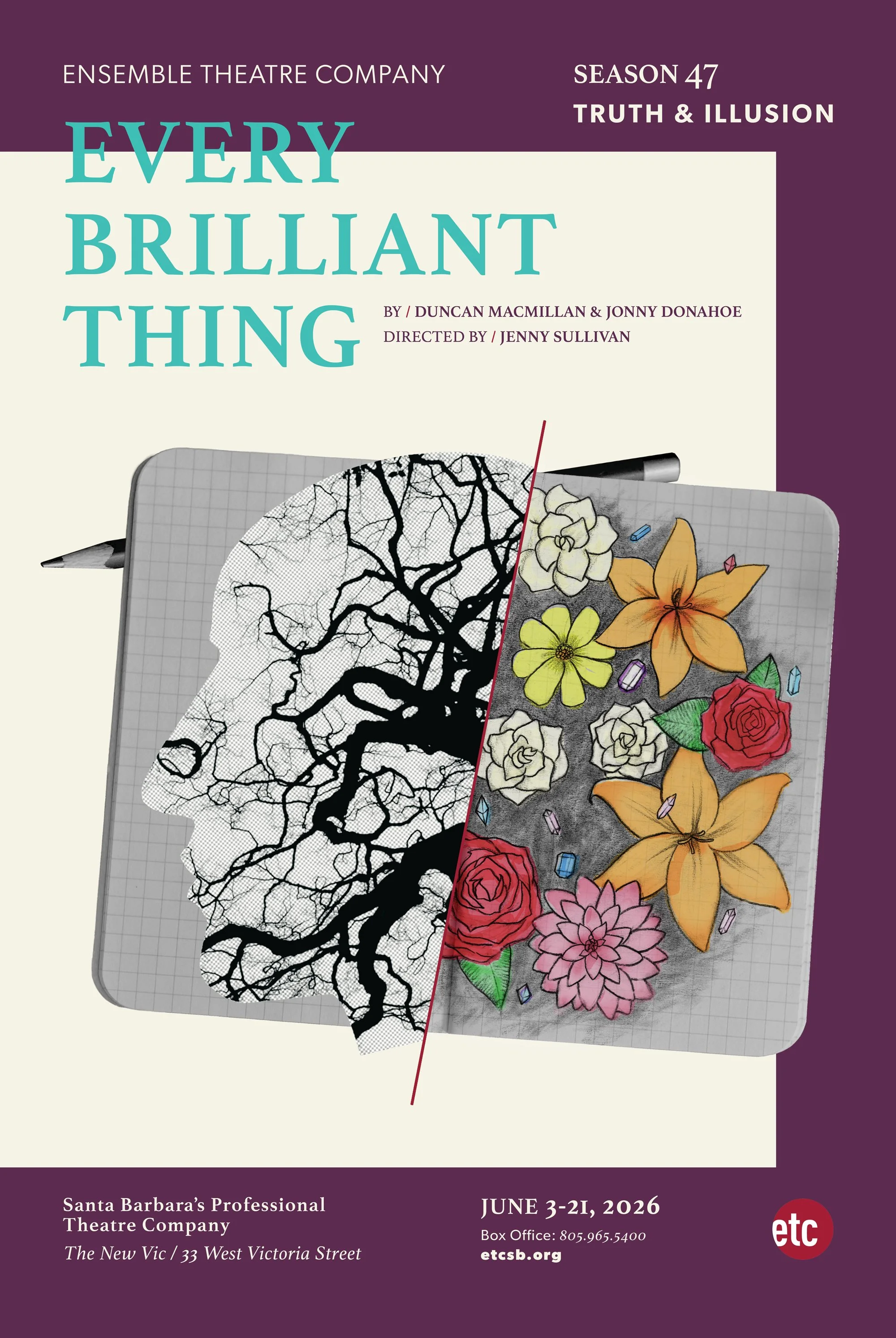
Poster design for the Ensemble Theatre Company of Santa Barbara’s 2025/26 season: “Truth & Illusion.” To highlight the polarity between the two, we chose found objects and photographs to represent Truth, and illustrations to represent the more ethereal and unreliable world of Illusion. For War of the Worlds, a radio / an invading alien; for Jane Austen, a stack of books / a romantic kiss in an alcove; and so on. These images were then set on items relevant to the play: an old playbill for War of the Worlds, stationery for Jane Austen, a film canister for The Shark is Broken, a few LP records for Janis Joplin, and a journal for Every Brilliant Thing. Colors were soft, offset with cream white and subtle changes in the type color, verging on rich blacks—except for Every Brilliant Thing, a very unique play that deserved its own brighter teal blue. The red slash, both in the credits type and in the line between image and illustration, is set in the ETC logo red, defining the theatre as where Truth and Illusion meet.
The typography is set in Gibson, a solid sans serif, and Athelas, a newer (2008) and elegant serif font inspired by British literature (hello, Jane Austen) and designed for both digital and print. These two, paired with an awareness of negative space throughout, are designed to create typographic tranquility.